The best new typefaces for February 2026
Written by admin on February 18, 2026
We’re well past the midpoint of February now. The post-January slump is officially over and, if this month’s type releases are anything to go by, the creative industry is well and truly back in gear. There’s a real sense of ambition running through these releases. Big ideas, careful craft, and more than a few stories that genuinely made me stop and read twice.
We’ve talking bespoke type for one of Britain’s most beloved animation studio, a landmark update to one of German design history’s most important typefaces – a quietly extraordinary multiscript collaboration that grew from a student project into something world-class… and that’s just for starters. More broadly, the breadth of multilingualism on show this month is also worth celebrating. Several of these releases take language support seriously in ways that go well beyond the usual checkbox.
1. Aeonik Soft by CoType Foundry
Aeonik is already the typeface of choice for Revolut, Eurosport and Alipay, so a new family member is worth paying attention to. Especially because Aeonik Soft doesn’t reinvent its parent; it reinterprets it.
Subtly curved corners replace the sharp geometric edges of the original, creating a tone that’s warmer and more approachable whilst keeping the neo-grotesque backbone entirely intact. It’s a nuanced shift; the kind that’s easy to miss at a glance but immediately felt in use.
This opens up applications the sharper original couldn’t quite reach: editorial, packaging, children’s content and UI design, to name but a few. Eight weights from Air to Black, matching italics, a variable font, and support for Latin, Vietnamese, Cyrillic, and Greek make this a genuinely comprehensive addition to an already dependable superfamily.
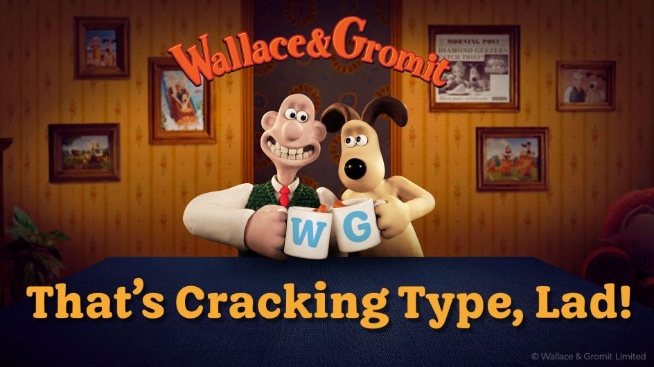
2. WG Buttered Crumpet by Jamie Clark Type
Bristol-based designer Jamie Clark was commissioned to create a bespoke typeface for Wallace & Gromit as part of a wider style guide project by Studio Griggs for Aardman. The result is Buttered Crumpet, and it’s truly delightful.
Drawing early inspiration from Oswald Cooper’s Cooper Black, Jamie has developed something softer and hand-crafted, with serifs shaped to resemble loaves of bread (as you do). While this is a bespoke commission and is not available for purchase, it’s a perfect example of custom type design done brilliantly: purposeful, characterful, and deeply appropriate to its subject.
Big fan of Aardman? Then you should also read my article What Aardman’s latest big move teaches us about creative survival.
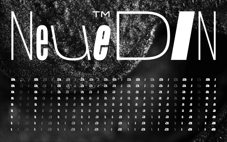
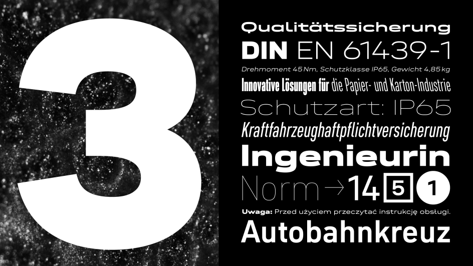
3. Neue DIN 2.0 by Andreas Frohloff, Olli Meier, and Hendrik Weber
Three years ago, Fontwerk’s Neue DIN won six major international awards for radically expanding DIN from XXCondensed to XXWide. Version 2.0 addresses the one gap in that vision: italics. But not just any italics; alongside 81 standard italic fonts, Fontwerk has added 81 left-slanted “Retalic” variants for striking, high-impact contexts, bringing total static options to 243. The variable font gains a third axis for slanting in both directions.
This might sound incremental, but the scale and quality of execution are anything but. DIN has been a fixture of German public life for a century; Neue DIN 2.0 continues the project of honouring that heritage whilst making it genuinely fit for now.
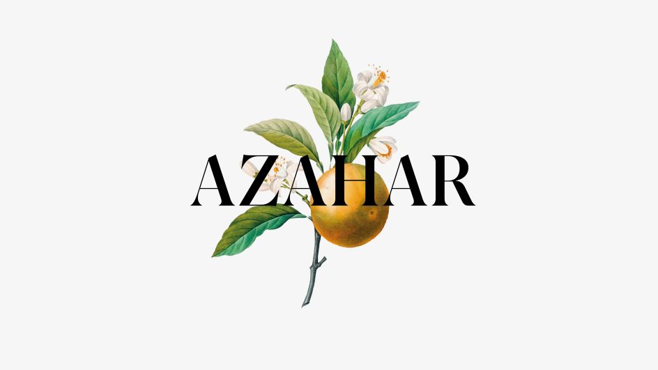
4. 29LT Azahar by Jose Carratalá, Krista Radoeva, and Naïma Ben Ayed
The name says it all: azahar is Spanish for orange blossom, derived from the Arabic الزَّهْرَة (az-zahra). And a word rooted in two cultures is an ideal moniker for a typeface spanning three scripts. 29LT Azahar is a variable superfamily covering Latin, Cyrillic and Arabic, developed collaboratively with each script treated as an equal partner throughout.
It grew from Jose Carratalá’s MA thesis at the University of Reading into something far more ambitious: shaped by Krista Radoeva on Cyrillic, Naïma Ben Ayed on Arabic and 29Letters founder Pascal Zoghbi overseeing the system. The Display version transforms practical text features into stylistic statements; the Text version offers warmth and classical proportion. The Latin details reward close attention; triangular terminals referencing stone-cut Roman capitals, an unconventional treatment of “g” that inverts Didone convention.
All in all, 29LT Azahar adds up to something genuinely rare: a multiscript family that feels unified rather than assembled.
5. KTF Prima by Kyiv Type Foundry
KTF Prima has been a decade in the making, and it shows in the best possible way. Yevgeniy Anfalov began it during his studies at ECAL, inspired by Forma, the warmer-than-average Italian modernist sans serif from Nebiolo. His response was a “one style fits all” system, redrawn entirely from scratch with no compromises forced by obsolete technology: clean contemporary structure from ultra-thin to ultra-black.
Flexibility comes from inherited proportions and a tall x-height rather than heavy stylistic differentiation; discreet in text, confident at display scale, without needing different fonts for each context. The Cyrillic alphabet was developed in parallel as a natural extension of the same logic. For designers who want a single, deeply considered type system that does everything without making a fuss, this is well worth checking out.
6. Augure Mono, Duo, and Stereo by Simon Renaud
Simon Renaud’s Augure already had a strong visual rhythm. These three extensions reinforce that quality through a rigorous system of character widths conceived as a regulating grid.
Augure Mono assigns all glyphs a uniform width. Augure Duo introduces a second, wider measure for capitals and broader letters, with the two widths related by a precise one-third proportional increase. Augure Stereo brings both together in a variable font, making that second width fully adjustable.
Overall, it’s the kind of typographic problem-solving that looks simple from the outside but reveals true depth the more you work with it.
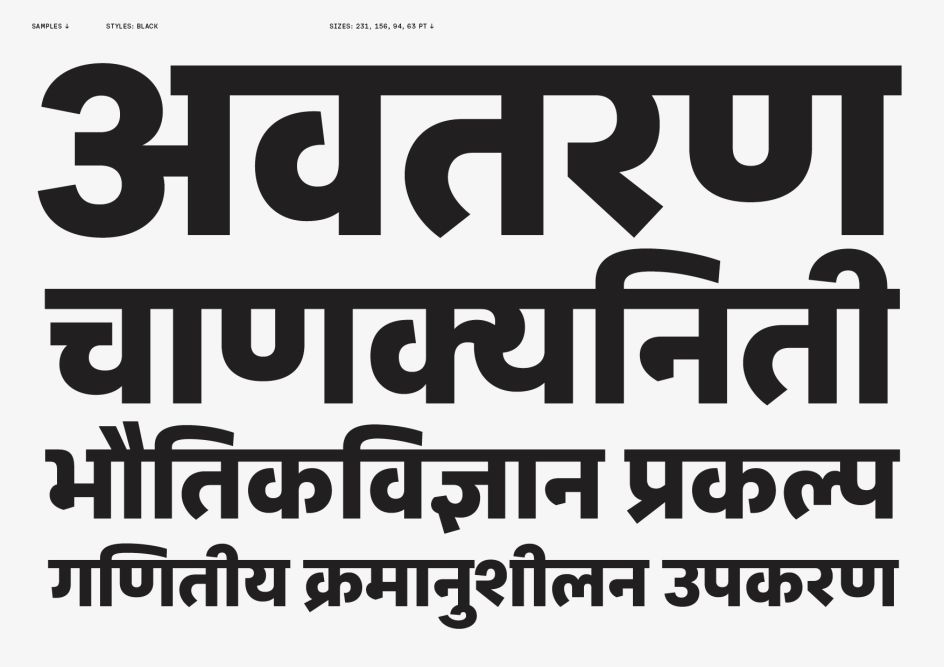
7. CoFo Sans Pro Devanagari by Contrast Foundry
CoFo Sans Pro Devanagari is that relatively rare thing: a script extension clearly designed to be part of a family rather than bolted onto one. Contrast Foundry collaborated with Mumbai-based type designer Kimya Gandhi to create a companion that works seamlessly in multilingual Latin–Cyrillic–Devanagari settings. Open counters, softly rounded knots, and simplified matras give it warmth without compromising legibility across text and display sizes.
It’s also worth noting that this is a female-led project (Maria Doreuli on Latin and Cyrillic, Gandhi on Devanagari). This font is available in eight weights from Hairline to Black.
8. Veloce by Rob Andrews
Every so often, a debut release arrives that makes you think: this person has been saving up ideas for a long time. Named after a garaged Alfa Romeo (another project Rob Andrews promised himself he’d finish), Veloce began as a single-weight studio font and grew into something with real range. Clear and neutral, with enough personality to avoid feeling anonymous, it’s a strong choice for both body text and signage.
What really sets it apart, though, is the language coverage. Beyond Cyrillic, Greek, and Vietnamese, Andrews has included Pinyin Chinese and Nigerian and International African alphabet characters. It’s an unusually thoughtful decision for a debut, reflecting serious long-term thinking about global communication.
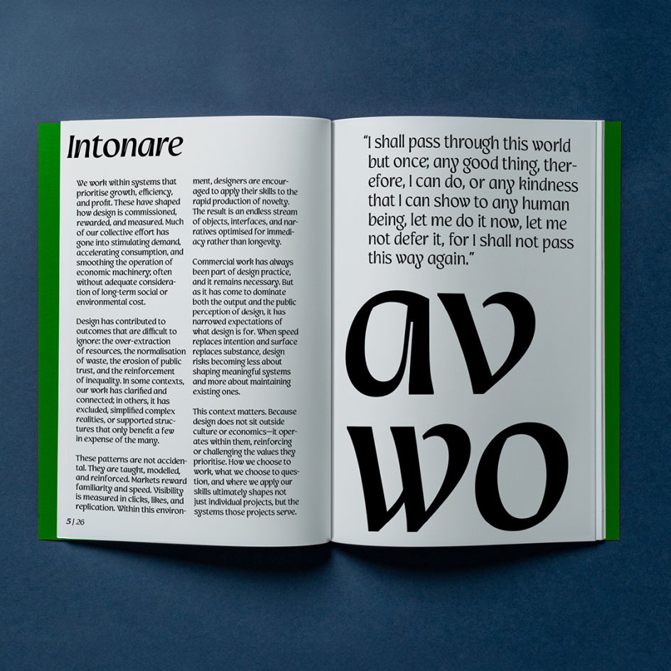
9. Intonare by Applied Systems Design Studio
Roundhand typefaces can easily tip into pastiche. Intonare avoids this by treating its calligraphic origins as a structural principle rather than a decorative reference. Rooted in the measured movement of the round-hand pen, it reinterprets historical pen lettering through a modern typographic system: fluid transitions, deliberate stroke structures, and decoration that emerges through motion rather than excess.
The largest family Applied Systems has released so far results in a contemporary roundhand that feels genuinely useful. It’s warm and characterful for display and brand work, without the fussiness that often accompanies scripts of this kind.
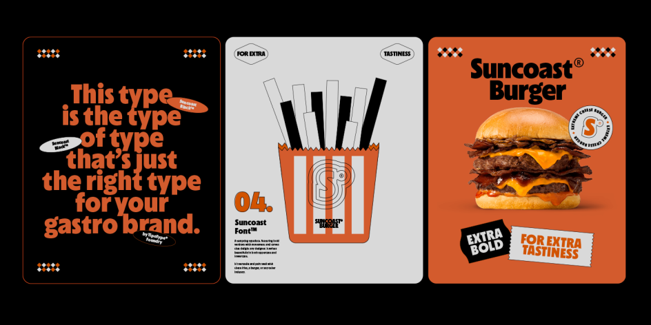
10. Suncoast by Tipotype
Suncoast offers designers two complementary typefaces (Suncoast Grotesque and Suncoast Humanist) that can be mixed and matched within the same visual world. One brings functional solidity; the other, flowing warmth. Together, they let the typographic tone modulate depending on context without losing cohesion.
Positioned firmly in the commercial product space (packaging, retail, wine labels, cosmetics), Suncoast knows its market and serves it well. Not every typeface needs to aspire to editorial gravitas, and this one is all the better for knowing exactly where it belongs.
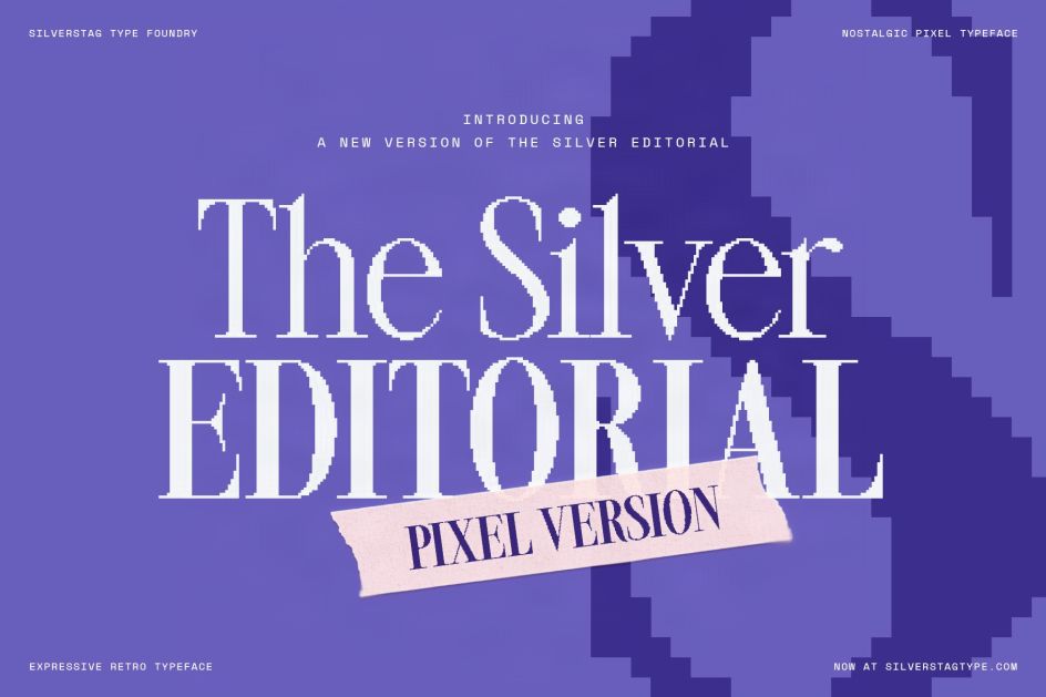
11. SLTF The Silver Editorial Pixel Version by SilverStag Type Foundry
Pixel typography is having a genuine renaissance right now, and SLTF taps into it with more sophistication than most, grounding the aesthetic in editorial sensibility rather than pure retro-game nostalgia.
“Luxury meets arcade, fashion meets 8-bit, magazine elegance with just the right amount of grit.” The pitch is clear, confident and best of all, the concept delivers. Four fonts (Pixel Thin, Pixel Regular, Pixel Black, and the clean Silver Editorial Regular for pairing) allow designers to move between refined and deliberately rough within a single visual world, without reaching for a different family to achieve the contrast.
12. Chubasco by Enigma
Enigma is primarily a bespoke type studio, and Chubasco is its first step into the retail market — arriving with the assurance of a foundry that’s spent years solving real branding problems. A black sans serif built for impact, it boasts a high x-height, compact proportions and a confident mix of square and rounded forms.
Custom ligatures in both uppercase and lowercase add dynamic flow and seamless character connections to an otherwise geometric structure. A good choice for branding, posters and packaging that need a strong typographic personality at large sizes.
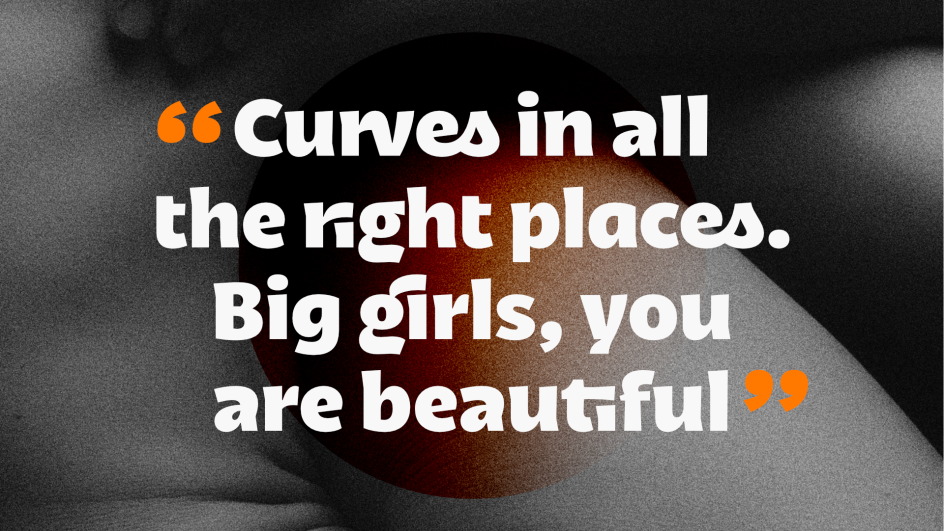
13. RNT Ify by Right Now Type
RNT Ify (“I Feel You”) is the debut from Right Now Type: designers Wouter Van Nes and Walter Oscar Rothe, based in Ghent and Antwerp, Belgium. Inspired by rounded lettering in magazines and street signs, the typeface starts almost monolinear before precise inktraps introduce character and a modern, retro-futuristic edge.
It’s a subtle move that pays dividends across sizes, catching light in ways purely monolinear fonts can’t. A considered debut with a clear point of view: we’re excited to see what this fledgling foundry does next.
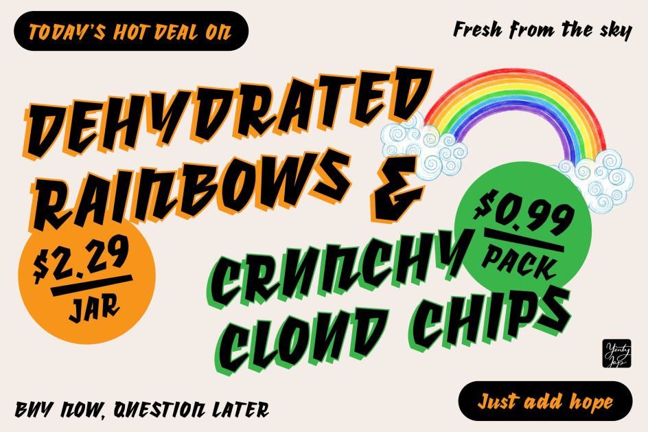
14. YJ Knotted Ink by Yenty Jap Creative
Sometimes you just want a typeface made by a human being for other human beings. YJ Knotted Ink is exactly that: a bold, hand-drawn display font with a knotted ink texture that gives letterforms a stamped, tactile quality; rounded, intentionally imperfect and genuinely warm.
This is no digital approximation of roughness, but the real visual quality of ink on paper. For small business branding, packaging and social content where handmade personality matters more than systematic polish, this delivers.
Reader's opinions

Continue reading