How to Write a PR Report That Proves Your Impact
Written by admin on December 23, 2025
A PR report gets read when it clearly shows how communications work supports real business goals, not just media activity. The most effective reports move past raw coverage counts and highlight outcomes that matter to decision-makers, like reputation shifts, audience behavior, or impact on the sales pipeline.
Instead of listing mentions, they explain why those mentions mattered and what changed as a result. Many teams find this hard, especially when reporting starts in spreadsheets instead of with strategy.
This guide on how to write a PR report offers a practical structure to turn PR data into a clear story leaders can trust, keep reading to see how.
Key Takeaways
- Start with the business objective, not the PR activity.
- Focus on a few key metrics that tell a clear story.
- Use visuals and plain language to make data accessible.
Start with the “Why” Before the “What”
Before we type a single word, we have to define the report’s purpose. Is this a monthly performance snapshot or a deep dive on a specific campaign? The answer shapes everything.
Our first question should always be: what business goal were we supporting? Maybe it was boosting brand awareness for a new product launch or improving sentiment after a market shift.
This focus on the “why” ensures our report stays relevant to the people reading it. It moves the conversation from “what we did” to “why it matters.”
We also need to know our audience. An internal PR team might need granular details about which journalist responded to a pitch.
The C-suite, on the other hand, needs a high-level view that links our efforts to revenue or market position. Tailoring the content to the reader’s perspective is the first step in making our report impactful. It’s about speaking their language.
A clear objective acts as a filter for all the data we collect. It helps us decide what to include and, just as importantly, what to leave out. Without this filter, we risk drowning our stakeholders in a sea of irrelevant numbers. The goal is clarity, not comprehensiveness.
- Campaign Review: Detailed analysis of a specific initiative.
- Monthly/Quarterly Update: Ongoing performance tracking against KPIs.
- Annual Performance: A high-level summary of yearly achievements and learnings. [1]
Gathering Data That Tells a Story

Data collection can feel overwhelming. There are so many potential data points, from website traffic referrals to social media engagement metrics.
The key is to be selective. We should gather metrics that directly relate to the objectives we defined. If the goal was audience reach, then estimated views and impressions are crucial. If it was credibility, then domain authority of the publications covering us is a vital stat.
Our toolkit here is diverse. Google Analytics shows us how media coverage drives website traffic. Social media platforms provide their own analytics on shares and comments. Media monitoring tools help us track mentions and measure share of voice.
Even a simple Google Sheets spreadsheet can be a powerful way to log and organize our findings. The tool matters less than the consistency of our tracking.
Analysis is where the magic happens. It’s not enough to say we got 50 media mentions. We need to interpret that number. Did those mentions have a positive sentiment? Did they appear in publications our target audience actually reads? This is where we move from reporting data to providing insights.
We look for trends, like a spike in coverage after a successful press release, or anomalies that need explanation, where clear charts and graphs help surface patterns and make PR data visualisation more effective for spotting changes early.
Structuring the Report for Maximum Impact
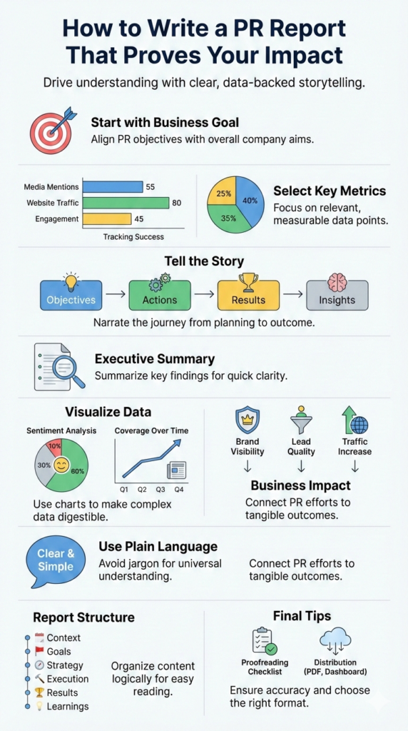
We’ve always liked the idea that a good report feels less like a document and more like a guided tour. You don’t throw people into a room full of charts and hope they figure it out. You walk them through it, one clear step at a time.
A logical structure guides the reader through our story without confusion. It sets the pace, shows what matters first, and reduces the mental load on whoever is reading, whether that’s an executive skimming between meetings or a teammate trying to learn from the campaign.
While templates can be helpful, the core sections of a strong PR report are fairly universal: context, goals, strategy, execution, results, and what we’ve learned. Each part answers a specific question in the reader’s mind, so they never feel lost or forced to guess what they’re looking at.
We should think of it as building an argument, with each section supporting the main thesis: our PR work delivered value. That argument shouldn’t be hidden.
We want the logic to feel almost obvious: here’s what we set out to do, here’s what we did, here’s what happened, and here’s why it matters. Data slides in to back up the story, not to replace it.
Quotes, screenshots, and short examples can stand beside the numbers so readers can “see” the impact instead of just reading about it.
When the structure works, the reader doesn’t have to work as hard. They can move from one section to the next and feel a thread pulling them forward.
By the time they reach the end, they should be able to restate the main message in their own words: this PR effort created real, measurable value, and here’s the proof.
Following a clear structure helps your report tell a compelling story, with a comprehensive PR reporting structure that guides insights logically from context to outcomes.
The Executive Summary
This is the most important part of the report, yet we write it last. We do that on purpose. By the time we reach the end of the report, we actually understand the full story, what worked, what didn’t, and what matters most.
Credits: SANÉ IN PR
The executive summary is a concise overview, just a few paragraphs, that states the objectives, highlights the key results, and summarizes the main insights in plain, direct language. It shouldn’t feel dense or academic; it should feel like a clear briefing you could read in an elevator ride.
Busy executives might only read this section, so it must stand on its own. If someone read only these few paragraphs and nothing else, they should still walk away with a solid understanding of what happened, why it matters, and what we recommend next.
It should answer their primary question: “So, what did we accomplish?” but also quietly address the follow-ups they’re likely thinking: “Was it worth the investment?” and “What should we keep or change going forward?” Structurally, it often works well to move in this order: objectives, key actions taken, top-line outcomes, and then one or two simple forward-looking recommendations.
No jargon, no deep detail, just the clearest version of the story.
Detailing Activities and Results
Here’s where we get into the specifics and let the reader see how the story actually unfolded. The introduction sets the stage by reiterating goals and methodology: who we were trying to reach, over what time period, and with which channels.
This part doesn’t need to be long, but it should be sharp enough that someone new to the project can follow the rest without guessing.
A sentence or two explaining the context (such as a product launch, reputation challenge, or thought leadership push) can also help anchor the details that follow.
Then, in the results section, we present the data. This is where visuals are critical, because they do a lot of heavy lifting for the reader. A bar chart comparing media coverage over time is far easier to digest than a paragraph full of numbers.
Line graphs, pie charts, and simple tables can show trends in reach, share of voice, sentiment, or engagement at a glance. Each visual should have a short, plain-language caption that explains the takeaway, what the reader should notice and why it matters.
Instead of just posting metrics, we connect them back to the goals: Did we increase positive coverage? Did we grow presence in priority outlets? Did our digital efforts drive measurable interaction? When activities and results sit side by side like this, the logic of the report becomes much easier to follow.
- Media Coverage Metrics: Number of clips, quality of placements, estimated reach.
- Audience Engagement: Social media shares, comments, and audience reach.
- Business Outcomes: Website traffic from referrals, lead generation, impact on brand awareness.
The insights portion is our analysis of the results. We explain what the data means. For example, “Our focus on trade publications resulted in higher-quality leads, even though the total number of mentions was lower than last quarter.” This shows we’re not just collecting numbers, we’re thinking strategically.
When evaluating press release distribution, it’s helpful to look at metrics that show how well each release performed, such as engagement and reach, through press release performance metrics that reveal what resonates with audiences.
| PR Activity | Key Metric | Result | Business Impact |
| Product launch outreach | Media mentions | 48 placements | Increased brand visibility in tier-one media |
| Thought leadership pitch | Domain authority | Avg. DA 72 | Improved credibility with target audience |
| Press release distribution | Website traffic | +32% referral traffic | Higher engagement on product pages |
| Social media amplification | Engagement rate | 4.6% average | Stronger audience interaction |
| Trade publication focus | Lead quality | Higher intent leads | Better alignment with sales pipeline |
Making It Visually Persuasive

The look and feel of our report influence how it’s received. A wall of text will intimidate readers, no matter how brilliant the insights. We use design to create accessibility. A branded template with our logo and colors adds professionalism. Ample white space and clear subheadings break up the content, making it less daunting. [2]
Visuals are our best friend. A pie chart showing the breakdown of sentiment (positive, neutral, negative) communicates instantly. A table comparing key performance indicators against targets allows for quick scanning.
We should use these elements to highlight the most important information. The goal is to make the data easy to understand at a glance.
Our writing style matters too. We use active voice and plain language. Instead of “A utilization of multiple channels was undertaken,” we write “We launched a campaign across social media and email.”
We avoid public relations jargon that might alienate readers in other departments. The tone should be objective when stating facts but can be persuasive when making recommendations, always backed by the evidence we’ve just presented.
Putting It All Together

The final step is about polish and distribution. We proofread meticulously. A typo or incorrect number can undermine our credibility. We compile final totals, like total readership across all media mentions.
It’s a good idea to have a colleague review it to test for clarity. Does the story make sense to someone who wasn’t involved in the day-to-day work?
We then choose the right format for sharing. A static PDF is common, but an interactive reporting dashboard can be more engaging, allowing stakeholders to filter data themselves.
When we distribute the report, whether by email or in a meeting, we provide context. We briefly recap the highlights and frame the discussion around next steps. This turns the report from a look backward into a plan forward.
FAQ
How do you write a PR report that shows real business outcomes?
To write a PR report, start with clear objectives and goals tied directly to business outcomes. Summarize PR activities, PR efforts, and campaign activities using clear data points such as media mentions, website traffic, audience reach, and sentiment analysis.
Focus on actionable insights rather than listing media coverage alone. Use simple visuals in Google Sheets or a reporting dashboard to clearly show how PR work supports business goals.
What PR metrics matter most when reporting campaign results?
PR metrics should align with your PR strategy and PR campaign goals. Key metrics include media coverage metrics, share of voice, domain authority, estimated views, engagement metrics, and social media engagement.
These key performance indicators help PR teams explain how earned media, press releases, and media relations contribute to brand awareness and audience engagement.
How often should PR teams create reports and coverage reports?
Reporting cadence depends on the scope of the campaign and business needs. Many PR teams use regular reporting, such as monthly PR reports or a quarterly PR campaign report.
Ongoing PR reporting helps teams track media mentions, media coverage, and website traffic over time. Consistent reporting makes trends easier to identify and supports better decisions about PR activities.
What tools help with PR reporting and media monitoring?
PR software, media monitoring tools, and simple setups like Google Sheets can all support effective PR reporting. Teams may use a PR reporting dashboard or reporting dashboard to track media mention data, social media activity, and earned media performance. Some tools offer a free trial, which can be useful for testing report examples or a report template before making a long-term commitment.
What should PR reports include beyond media coverage numbers?
Strong PR reports go beyond media coverage counts and focus on audience engagement, business goals, and business outcomes. Include PR metrics related to digital PR, social media, and broader public relations efforts. Use report examples, a clear report template, and specific explanations of why each data point matters. This approach helps PR teams turn coverage reports into clear, actionable decisions.
Writing PR Reports That Prove Value and Get Results
Writing a PR report is a discipline that pushes teams to measure work against real business goals, not daily tasks. A strong report builds trust, shows accountability, and positions PR as a strategic partner.
By setting clear objectives, telling a clear story with data, and presenting it simply, reports get read and acted on. To extend that impact, tools like NewswireJet help distribute press releases widely and support measurable outcomes with clear reporting.
Related Articles
- https://newswirejet.com/visualising-pr-data-effectively/
- https://newswirejet.com/creating-comprehensive-pr-reports/
- https://newswirejet.com/measuring-press-release-success/
References
- https://www.nngroup.com/articles/consistency-and-standards/
- https://moldstud.com/articles/p-effective-data-visualization-for-insightful-communication)